PROJECT OVERVIEW
Duration: 3.5 Months | Team: 4 Designers, 1 Design Lead, 1 Engineer | My Role: Content & UX Designer
THE CHALLENGE
The Global Legal Review (GLR) was a complex legal process at Accenture for approving new tools and technologies globally, ensuring personal data rights are protected under varying international laws. This process involved numerous stakeholders and could take years to complete due to its complexity. For the MVP, we focused on two key actors:
Project Managers (PMs): These were the individuals seeking approval for new tools, responsible for completing the lengthy questionnaire but often lacking legal expertise.
Legal Assessment Coordinators (LACs): These lawyers reviewed and owned each case, carrying it through the approval process and ensuring compliance with international regulations.
The GLR process faced several critical problems:
Time-intensive process that could take years to complete
200+ question legal questionnaire that was overly complex for non-lawyers
Manual workflows lacking centralization or automation
Conflicting user needs between lawyers who needed complete information and project managers who struggled with complex legal concepts
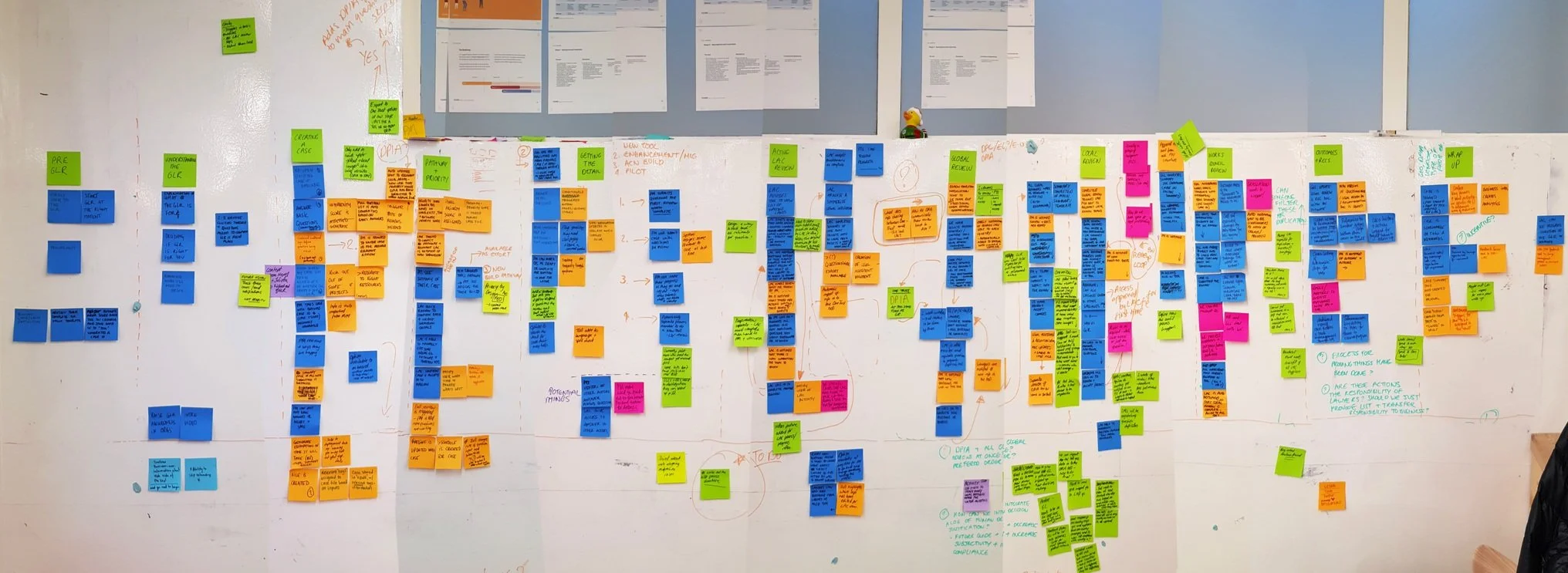
A prior Phase 0 led to a deep understanding of the existing process and the pain points for both user groups.
MY APPROACH
Discovery & Research
I led targeted research to understand both user groups' perspectives:
Conducted surveys and interviews with Project Managers (PMs) and Legal Assessment Coordinators (LACs)
Mapped the existing process to identify redundancies and pain points
Ranked questions by legal significance and difficulty level
Analyzed communication patterns between stakeholders
Survey spreadsheet capturing legal assessment data from LAC lawyers, including question-to-law mappings, conditional impacts of answers, and legal significance rankings with explanations—providing critical quantitative and qualitative insights to inform the GLR questionnaire redesign.
Key Insights:
Both groups worked across fragmented systems (email, SharePoint, Excel)
PMs struggled with legal terminology and lacked context for questions
PMs couldn't track their progress through the approval workflow or see what steps remained to complete the process
LACs spent excessive time tracking down incomplete information
Content Strategy & Information Architecture
I developed a systematic approach to restructuring the questionnaire:
Content Audit & Mapping: Categorized related questions and identified conditional logic
Content Reduction: Eliminated redundant questions, reducing questionnaire length by 50%
Logic Mapping: Created branching patterns to show only relevant questions based on previous answers
Plain Language Rewriting: Simplified complex legal terminology while preserving legal accuracy
Structure Development: Organized content into 2 sections, 9 sub-sections, and 21 pages
Design Process
I transformed the content strategy into a usable interface:
Interaction Design: Reduced clicks per question from 30 to 1-3
Progressive Disclosure: Created conditional triggering for relevant follow-up questions
Navigation Design: Developed an intuitive progress bar showing completion status
Prototyping & Testing: Tested with real case scenarios and iterated based on feedback
SOLVING KEY CHALLENGES
Challenge #1: Balancing Conflicting User Needs
Challenge: PMs wanted to skip difficult questions, while LACs needed complete information.
Process:
Analyzed impact of skipped questions on legal assessment process
Tested multiple approaches with both user groups
Facilitated stakeholder discussions to align on requirements
Solution: Created a compromise that let users skip temporarily but required completion before final submission, with clear messaging about expectations.
Challenge #2: Building Human-in-the-Loop Safeguards
Challenge: The backend logic couldn't anticipate all legal nuances and edge cases requiring specialized assessment.
Process:
Mapped legal review workflow to identify critical decision points
Collaborated with LACs to understand where human judgment was essential
Designed the progress bar to communicate review checkpoints
Solution: Structured content into logical sections with completion checkpoints that:
Enabled LAC review at strategic points before users could proceed
Identified edge cases automated logic couldn't capture
Added custom requirements based on case specifics
Used progress bar lock icons to indicate sections awaiting LAC review
Challenge #3: Designing Complex Question Types
Challenge: Questions with "select all that apply OR none" options created confusion.
Process:
Prototyped multiple UI approaches
Conducted user testing to identify the clearest solution
Refined visual hierarchy to improve comprehension
Solution: Implemented all-checkbox design with clear visual separation and language cues, validated through user testing.
Challenge #4: Building an Adaptive Information Architecture
Challenge: Conditional logic created unpredictable questionnaire paths.
Process:
Mapped all possible question paths
Evaluated multiple approaches for displaying conditional questions:
Immediately after trigger question
At the bottom of the current page
On separate pages
Tested options with users and discussed technical constraints with developers
Solution: Designed triggered questions to appear immediately after their parent question, maintaining context and relevance. This approach avoided technical complexity of separate pages (which would confuse users by unexpectedly adding to the progress bar) while providing better context than bottom-of-page placement.
Accenture's GLR platform featuring the redesigned user interface with intuitive progress tracking, contextual question triggers, and categorized content—providing a streamlined experience for both lawyers and project managers throughout the complex approval process.
OUTCOMES & IMPACT
My content-first approach delivered significant business results:
65% reduction in time to approve cases
30% increase in first-attempt approval rate
50% reduction in questionnaire length
Streamlined experience from 30 clicks per question to 1-3
Implementation & Handoff
Collaborated directly with developers to build the MVP
Documented conditional logic and design patterns for future development
Created comprehensive handoff materials for the delivery team
Supported the transition to full production
REFLECTION & LESSONS LEARNED
This project demonstrated how content strategy can transform complex processes. By focusing on the underlying structure and language before visual design, I created a solution that balanced legal requirements with usability needs.
The section-based approach with strategic human checkpoints proved that effective digital transformation doesn't mean removing human expertise—it means creating systems where technology handles routine tasks while preserving space for human judgment where it adds the most value.
Key Lessons:
Multidisciplinary Design Leadership: Leading both content design and interaction design allowed me to create an integrated solution where information architecture and user interface worked seamlessly together—crucial for transforming complex legal processes into intuitive experiences.
Stakeholder Management Is Critical: When working with stakeholders who have vastly different perspectives (like lawyers and project managers), continuous communication and giving everyone a voice at the design table proved essential. This approach helped build trust with legal experts who initially resisted simplification.
Simplification Requires Persistence: Our key stakeholders were lawyers who believed complex information must remain complex. By patiently demonstrating how simplification could still meet their core needs, we transformed their source of truth into something radically different yet still legally sound—resulting in the 65% reduction in approval times.
This multidisciplinary approach to designing complex systems has become central to how I approach all design challenges, balancing user needs with business requirements while delivering measurable impact.